Project Spotlight: self-aware-grid
Open-source NPM package for enhancing functionality of CSS grids.

Finding (and fixing) a hole in CSS Grid
SelfAwareGrid came about when a design for a customer's website contained a tricky set of requirements:
- The UI contains a grid where child elements are styled based on their position within the grid.
- The grid needs to be responsive -- that is, it must maintain its position-based styling even if the size/flow of the grid changes (e.g. it gains or loses columns or rows).
- We need to be able to determine which grid item is next to, beneath, or above another.
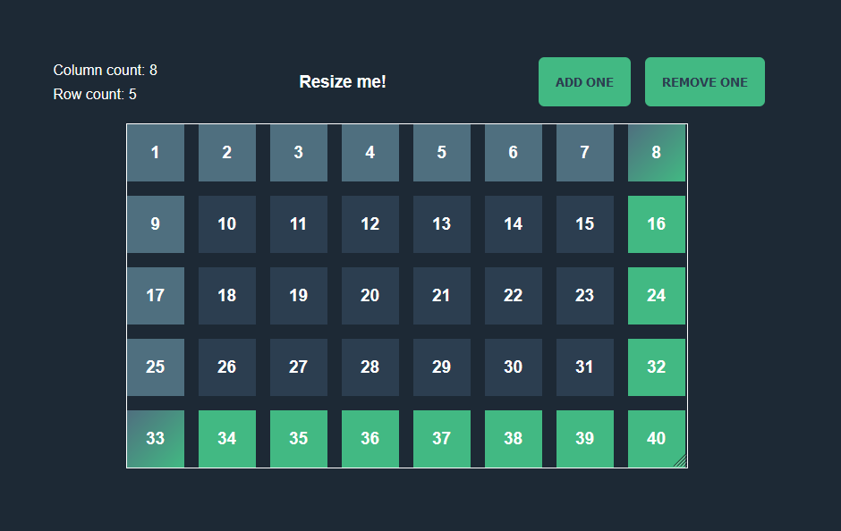
CSS Grid is well-known as a powerful feature of the modern web, but after diving into those requirements, I learned that it lacks the ability to dynamically target X row or Y column. We can style elements within grids based on their index using the nth-child selector, but we don't have broader positional selectors such as top-row or rightmost-column. Notably, this prevents us from accomplishing the second requirement above. If the grid becomes wider via more columns, for example, your rightmost column won't be styled correctly because the styles were only ever based on index, not position. Likewise, we can't take it further by easily grabbing a grid element based on its adjacency to another.
demo of grid that breaks with more columns or rows
demo with self-aware-grid allowing the functionality we want
demo showing adjacent squares to the selected one
I created self-aware-grid to solve this problem. Other developers must have run into this before (in fact, I found a thread somewhere from Wes Bos of syntax.fm asking whether this very thing was possible), so why not come up with a solution and throw my hat into the ring of open-source for the first time?
How it works
The API of self-aware-grid makes it very easy to set up:
import SelfAwareGrid from 'self-aware-grid';

// Grab the grid element and pass it to SelfAwareGrid
const myGrid = document.getElementById('my-grid');
const selfAwareGrid = new SelfAwareGrid(myGrid);
So what is it doing?
The first step is to determine how many columns and rows the grid has. We do this by calculating the overall dimensions of the grid and comparing it to the sizes of its columns, rows, and spacing.
GitHub file link showing the functions that set this up
self-aware-grid uses event listeners to recalculate these values when the size of the given grid changes, such as via viewport size changes or otherwise.
Now that we know the dimensions of the grid in rows and columns, the next simplest requirement to tackle is requirement 3 -- we'll get to requirement 2 afterward.
Requirement 3 states:
We need to be able to determine which grid item is next to, beneath, or above another.
We'll call this adjacency detection for short. Here is the logic we'll follow to detect adjacent children to a given grid child:
- LEFT: To get the index of the grid child to the left of a particular child, use the index - 1.
- RIGHT: To get the index of the grid child to the right of a particular child, use the index + 1.
- ABOVE: Subtract the grid’s column count from the child’s index. For example, if the child in question is at index 4 in a grid of 3 columns, we can find the index of the child directly above it with
4 - 3. This gives us the correct result of1. - BELOW: As above, so below. Except, you know, reversed in this case. Add the column count to the index in order to find the child directly underneath a given child.
But what happens if you try to find a grid child outside the bounds of the grid? For example, a grid child in the top row would have no children above it. We can combine the positional logic with additional boundary checks to determine whether a grid child is in a given position:
- Index is in top row: The grid item’s index will be less than the grid’s column count.
- Index is in bottom row: The grid item’s index will be greater than or equal to the highest possible index in the grid.
- Index is in Nth column: A child is in the Nth column if the index modulo the total number of columns equals N.
- Index is in the left column: Use the Nth-column logic, where N is 0
- Index is in the right column: Use the Nth-column logic, where N is the column count minus 1.
Let's write this in TypeScript then:
function isTopRow (gridItemIndex: number): boolean {
    return gridItemIndex < this._columnCount;
}

function isBottomRow (gridItemIndex: number): boolean {
    const columns = this._columnCount;
    const rows = this._rowCount;
    const highestPotentialIndex = rows * columns - 1;
    return gridItemIndex >= highestPotentialIndex - columns + 1;
}

function isNthColumn (childElementIndex: number): number {
    if (!this._children[childElementIndex]) return -1;
    return childElementIndex % this._columnCount;
}

function isLeftColumn (gridItemIndex: number): boolean {
    return this.isNthColumn(gridItemIndex) === 0;
}

function isRightColumn (gridItemIndex: number): boolean {
    return this.isNthColumn(gridItemIndex) === this._columnCount - 1;
}
We'll use the positional checker functions to set up our adjacency detection:
function getGridItemAbove (gridItemIndex: number): number {
    return this.isTopRow(gridItemIndex)
        ? 0
        : gridItemIndex - this._columnCount;
}

function getGridItemBelow (gridItemIndex: number): number {
    return this.isBottomRow(gridItemIndex)
        ? this._children.length - 1
        : gridItemIndex + this._columnCount;
}

function getGridItemToTheLeft (gridItemIndex: number, preventWrap?: boolean): number {
    if (preventWrap) return this.isNthColumn(gridItemIndex) === 0
        ? gridItemIndex
        : gridItemIndex - 1;
    else return gridItemIndex - 1;
}

function getGridItemToTheRight (gridItemIndex: number): number {
    return gridItemIndex <= this._children.length
        ? gridItemIndex + 1
        : gridItemIndex;
}
(We also add some extra arguments for preventing wrap behavior when desired, as this doesn’t complicate the logic much at all. Those arguments are omitted here for cleanliness and readability).
article is work in progress